Furnishing with antique furniture is an art of balance, awareness, and aesthetic sensitivity. These pieces, rich in history and character, can transform a generic space into a vibrant, authentic environment with a story to tell. To showcase them effectively, each antique must harmonize with its surroundings—and in this dialogue, color plays a fundamental role.
There’s no single rule or universal palette: the secret lies in balancing tones, materials, eras, and lighting. This article is a guide for those who wish to enhance antique furniture through mindful color choices that highlight without overwhelming, and envelop without concealing.
Understanding the Soul of the Furniture: Style, Wood, Era
Before choosing a color to pair with an antique piece, it’s essential to understand what type of furniture it is. A Louis XV chest of drawers in inlaid walnut requires a different approach than a sleek Art Deco display cabinet in rosewood, or a rustic Tuscan sideboard in chestnut.
Each era brought its own aesthetic vision of color. The 18th century loved pastel tones, Neoclassicism favored soft grays and earth tones, the Romantic 19th century expressed itself in mossy greens and deep blues, while the 20th century flirted with sharp contrasts, lacquers, and bright colors. An antique piece retains this memory: respecting it doesn’t mean replicating it, but knowing how to reinterpret it in a contemporary way.
Sophisticated Neutrals: The White That Isn’t Just White
Many believe that white is the ideal color to make dark furniture stand out. But which white? Optical white, too cold, often creates a rigid and unnatural contrast. It’s better to opt for warm and soft tones, such as milk white, ivory, linen white, or pearl gray.
These neutral shades have the ability to offer visual space to the furniture, reflecting light softly and elegantly. They are perfect for rooms where you want to give centrality to one or more important pieces—a French wardrobe, an Empire console, a mahogany bookcase. Sophisticated neutrals are also excellent backdrops for walls with stucco, plaster frames, or antique paintings.
Historical Greens: From Sage to Bottle Green
Green is one of the colors historically most present in antique interiors: from the wainscoting of Parisian palaces to the velvet of bourgeois living rooms, to the enamels of oriental ceramics. It’s a color that evokes nature, balance, calmness, and pairs perfectly with warm woods like walnut, oak, and cherry.
The most suitable tones are desaturated ones, meaning without excessive brightness: sage green, moss green, olive green, or, in more austere environments, bottle green. These greens work very well in living rooms, studies, or hallways furnished with Empire or Neo-Renaissance furniture, conferring a sense of depth and sober prestige.
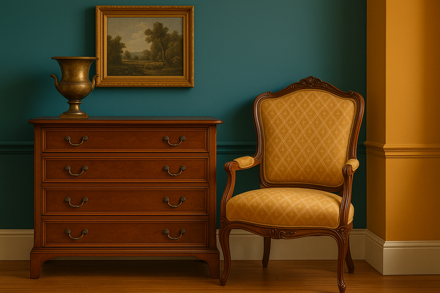
Dusty Blues, Antique Blues, and Touches of Night
Blue is an aristocratic color par excellence. In antiquity, it was one of the most expensive and rare pigments. Even today, used sparingly, it can give solemnity, freshness, and a certain regality to any environment. Burl wood furniture, mahogany feather, or maple are enhanced when paired with grayish-blue walls, sky blue, or dusty blue.
In more daring environments, you can also venture into Prussian blue or night blue, provided there is sufficient natural light or a well-designed lighting system. The contrast between blue and gold (of mirrors or frames) creates an elegant and timeless effect, perfect for entrances, dining rooms, or bedrooms in style.
Warm Tones: Ochre, Terracotta, Rust
Warm colors work particularly well with rustic, baroque, or colonial furniture. A piece of furniture in chestnut, ash, or oak can be accompanied by walls in light ochre, Siena earth, terracotta, or golden beige.
These colors evoke matter, sun, living stone. They are ideal for kitchens furnished with antique work tables, for living rooms with exposed beams, for environments where you want to create a continuity between interior and exterior. The risk with warm tones is saturation: it’s therefore important to dose them well and perhaps lighten them with light ceilings, natural fabrics, or wrought iron details.
Daring with Black (and Dark Tones)
Few do it, but black—used well—is the best ally of antique furniture. A matte black wall, paired with an eighteenth-century sideboard or a gilded mirror, creates a sophisticated, theatrical, and modern scenographic effect at the same time. The secret is in the finish: black must be deep but soft, perhaps tending towards charcoal or anthracite.
Next to black, you can also use intense browns, chocolate, dark taupe, perfect for evening environments, reading rooms, libraries, or studies. In this case, it’s essential to play with light, choose warm sources, antique lamps, or vintage sconces, to avoid the effect being gloomy.
A Final Tip: Look at the Color… in the Dark
Every color transforms itself based on natural light, the orientation of the room, the finish of the walls. Before choosing a color combination for a room with antique furniture, it’s advisable to observe the color in all phases of the day: in the morning, at sunset, with artificial light. Only in this way will you truly understand whether that tone enhances the furniture or extinguishes it.